There is a few views we have all been using to track our tasks and todo items on devices the same way we did it on our paper/pen counterparts. A list of individual task items, maybe with check boxes, some with indented sub items. Moving off paper onto computers, it became easier to add sub items and alter the view a bit with gantt type charting.
Many years ago, it was mentioned that the OSs of the future would allow us to reach ‘into’ folders. The closest we have seen is most often called ‘drilling down’, where there is more and more levels of detail depending on how much info you need without causing people uninterested having to view that level of detail.
A new (to us) app on the iPad called inShort seems to be taking a stab at this line of manageing projects and tasks. We are hoping for a updated UI, but the current version’s simplicity isn’t a bad thing. It does what we need it to do very well, why clutter it up with extras that aren’t going to help us get to our finish line.
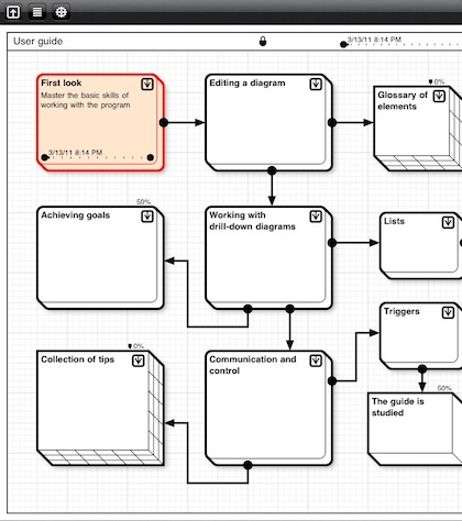
Getting started with a project using inShort, you will set up high level item boxes. These need to be high enough to not make people view things they do not need to but enough detail that anyone can follow the project along it’s path of it’s parts.
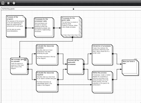
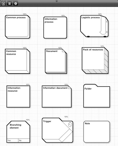
The variety of style of boxes in your inShort tasks layout represent if is a stand alone item or has other parts to make that square complete. Below is a whole work flow of tasks to be completed prior to the top level box being 100%.
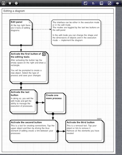
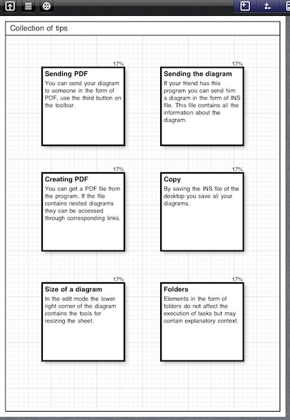
Sub items in a top level inShort task doe not have to have a flow or predecessors, they can be a list of individual items that must be completed. Both of these screens are gotten to through the arrow button on each box’s upper right corner.
The tasks flow can be viewed in Landscape or Portrait. All of the diagrams can be shared out via a PDF attached to an email, printed or exported as as a INS file for other inShort app users. Being a Universal app, the tasks can be viewed on the iPad or iPhone.
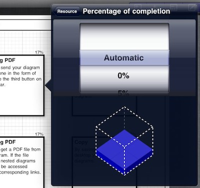
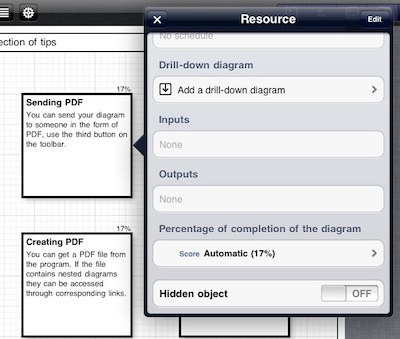
While we mentioned at the start that the UI is simple and ‘basic’, the percent complete box is colorful and dynamic with auto completing as the sub items are completed.
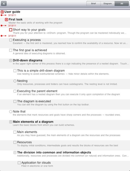
Do not fear alienating some project task owners that do not want to understand this line of project layout. There is still a list view available that auto creates from your graphic layout.
This is available at a single box level:
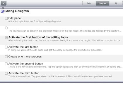 And viewable as a full project text list with sub items and check boxes:
The boxes used in the graphic tasks view of inShort has many options to best send the message to the viewers what is contained within it.
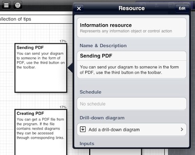
Each box and items within the box has options to add more information:
The many fine tuning options within the inShort app allows each user to make the experience what works best for them. From what the default view having grid lines to if the task flow opens in landscape or portrait. The app introduces a new way of thinking of projects and how they are laid out. Try the app a few times on projects around the house or your particular part of projects before rolling out to a full company project. With so many options and layers deep possible, it is best to start your rethink prior to expanding to the bigger group. It is an important tool though if for no other reason than getting a head start on how many system interactions of the future will work.
