We were split in the office about what we wanted to talk about in this post: We are seeing app updates being more about user experience and interfaces getting tuned… or did we talk about if people getting free previews are more or less likely to buy a product.
The app that fit both of our post ideas is the latest from Zinio, the magazine reader app.
Launching the app used to take you to a cover of a magazine. You could tap it to see a couple pages of the particular magazine or swipe left/right to see other covers. There was no sorting or categories for the magazines you could view. Navigation at the bottom of the page offered access to your library of magazines and the the store.
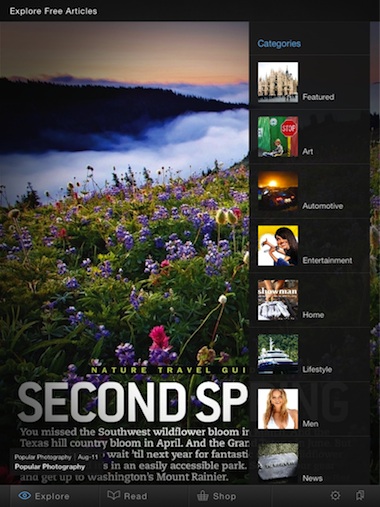
The Zinio folks must have taken a page from Apple’s iBooks app and are now offering a lot more magazine previews. Launching the Zinio app now presents you with a list of categories of magazines to review.
Choosing a category results in a cover view of one of the variety of magazines you can preview in that group. From here you may choose to view the sample pages of the magazine or jump right in to purchase. We always like it when someone makes it easy to purchase, a simple box is a big win.
Tapping the ‘Read’ button on the Zinio magazine preview box will take you to a variety of pages from the magazine. We went through many different magazines and found it interesting what some thought would be pages to show to convince people to buy. Magazine previews can have part of multiple articles, a complete article, and some with mostly pictures. We felt they may be missing a important page in most of the previews… the Table of Contents page!
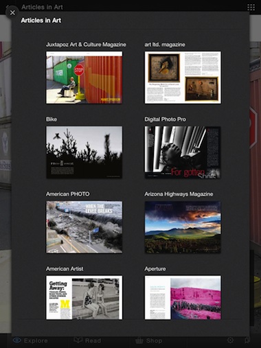
Use the ‘x’ in the upper left corner to move back out to the cover of the preview magazine. Tap the upper right cover ‘grid’ like icon to go to a list of more magazines in the category to review. The jumping from the main screen navigation to having to use the buttons at the top of the screen steps away from what we are used to in iPad apps.
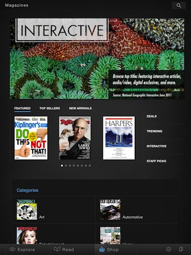
We were surprised to still see a shopping experience inside of the Zinio app since Amazon and Kobo pulled theirs. It has been improved over the previous version for a more iPad mixed with a Web site experience.
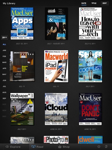
The magazine library view now scrolls up/down rather than left/right. This has been a item of much discussion… is sweeping side-to-side better or just familiar because that is hour our print books work.
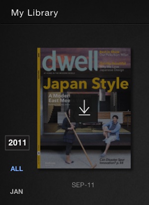
Previously, when a new version of a magazine appeared in your Zinio’s library to download, the date under the magazine cover was blue. The UI update now has a download icon on a shaded cover art, tap to install.
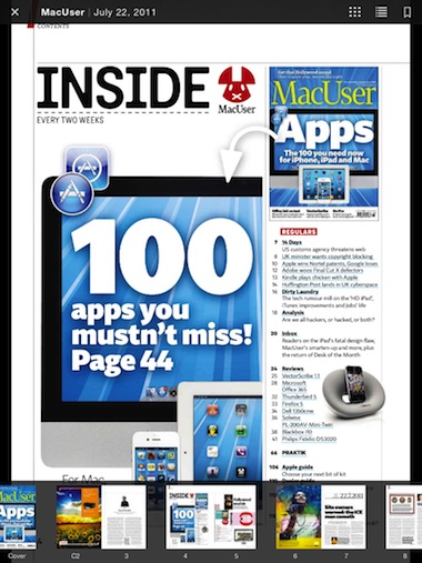
The magazine view is the same as it was previously with the addition of the upper right corner buttons; pages overview, table of contents and bookmarking.
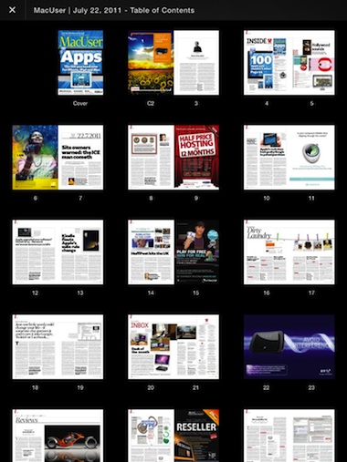
In addition to the above view of the magazine pages to sweep through, Zinio now offers an overview so you can see more of the magazine in a single view. A good example of the difference between an electronic magazine versus a print one. The ‘old’ method of moving through the pages is familiar but not an effective navigation path that can be taken on a digital device.
Bookmarks are put in a central location, think of it as a ‘favorites’ area. The bookmarks area can be reached through any screen via the shortcut icon in the corner of the screen. Another feature that is found with Apple’s iBooks that just makes sense for eBook readers.
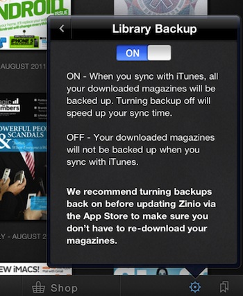
In the settings area, there is the ability to have your magazine downloads backed up during your iTunes sync. In the past, if you did a iPad restore, you had to re-download all of your Zinio magazines. Being backed up means they will be automatically installed with the restore, but also means more space on your computer being used up and perhaps a longer sync. Most likely a feature that many people wanted, we’ll let you know how many of us turn it off in the near future.
